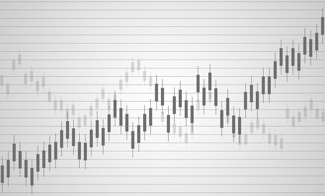
If you are keen on venturing into the financial markets, then candlestick charts would surely appear familiar. These charts serve as the lifeblood for traders, offering indispensable insights into market trends, asset movements, and potential investment opportunities. Below, we delve deep into the subject, dissecting everything you need to know about the iconic candlestick chart, how to interpret it, and the best practices involved in its use.
The Origin And Basics Of Candlestick Charts
The history of candlestick charts can be traced back to 18th-century Japan, originally used for trading rice commodities. A candlestick chart is comprised of individual candlesticks—each representing a specified period—and tells a compelling story regarding financial market movements. The name originated due to the shape of the bars, which mimic a candle and its wick. Each candlestick is marked with an open, high, low, and closing price, which combine to represent the price range of an asset within the specified period.
Often overshadowed by the actual chart, understanding the composition of a single candlestick is equally crucial. The main rectangular section of a candlestick is called the body, which manifests the price range between the open and close of that period. Affixed atop and below this main body are thinner lines, known as shadows or wicks, which demarcate the highest and lowest prices reached within that time frame.
The beauty of candlestick charts lies in their color-coding system. A hollow or green (often also represented in blue) candlestick signifies a closing price that is higher than the opening price, implying an overall increase in price. Conversely, a filled or red candlestick depicts a closing price that is lower than the opening price, indicating a net price decline.
Interpreting Candlestick Patterns
While seemingly daunting to newcomers, interpreting candlestick patterns can provide valuable market insights. These patterns are the foundation of candlestick chart analysis, strategically recognizing potential market movements. Simple candlestick patterns can be referred to as those involving a single or a couple of candlesticks, such as the doji or the engulfing pattern. These basic patterns are often the beginner's first point of contact with candlestick charts.
On the other hand, there exist complex candlestick patterns featuring three or more candlesticks, such as the morning star and evening star patterns. These might pose a higher analytical challenge but also reward with a higher degree of precision and effectiveness. Recognizing and understanding these patterns can greatly enhance your capability to make informed trading decisions.
Instead of seeing these patterns as mere shapes, they should be interpreted as manifestations of market psychology. They represent macroscopic summaries of numerous trading decisions made by market participants, thus further emphasizing the balance between demand and supply. However, it is important to remember not to rely solely on these patterns, as they are most effective when combined with other analytical tools.
Best Practices In Using Candlestick Charts
An effectual approach toward using candlestick graphs involves more than just recognizing patterns—it is also about integrating them with broader trading strategies and additional analytical tools. One of the best practices is to use candlestick graphs alongside technical indicators such as moving averages, Relative Strength Index (RSI), or Bollinger Bands. These tools, when used together, amplify the effectiveness of candlestick graphs by providing confirmations or warnings of potential reversals.
Another essential practice is having a thorough understanding of the market context. Even though candlestick patterns can provide valuable insights, it is crucial to understand that their effectiveness is influenced by various market conditions. For example, in volatile markets, certain patterns may lead to false signals, while in bearish or bullish markets, patterns may be validated or invalidated accordingly.
Lastly, practice and experience are the most effective teachers when it comes to mastering candlestick charts. Perfecting the ability to understand and interpret these charts is not an overnight feat—it requires diligent practice, continual learning, and a patient approach to confidently navigate the oscillating waves of the markets.
Candlestick Chart Conclusion
Overall, candlestick charts stand as a powerful tool in the diagrammatic representation of financial market data. They provide traders with an acute understanding of market dynamics, aiding in the prediction of potential market trends. It is also necessary to understand and respect their limitations, always complementing their use with other analytical tools and methodologies. Altogether, mastering candlestick charts signifies a significant stride toward becoming a successful trader.
